
Once the group came up with a name for our studio, and set about designing the logo.
I went through many iterations and the team and I bounced around many idea's and gave feedback on changes, until eventually we got the final design.


"Looks too much like the fantastic 4 logo"
I started off with some simple ideas and then fed back to the group, which we discussed and developed into more ideas and variations


We decided that the compass style idea had been used too many times before, so we decided to stay away from this idea and continue to develop the logo.


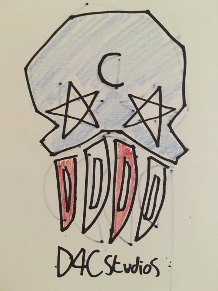
I eventually tried working in a skull in to the design after a suggestion from the group. I felt like the side of the skull didn't really look that great, so started to look at it from the front.


The group and I really liked the skull idea, so then looked at how we could incorporate the name into the logo. We looked at how the teeth could could be letters that look like teeth.


So once coming up with the rough ideas we spoke as a group to then see how we could develop this to become out final design.


The four final thumbnails.


So this are final designs for our logo. I have created the logo in three different colours. The two monochrome logos are just generic one with we can use universally throughout our work. And the colour logo is for promotional use.


- Brad
No comments:
Post a Comment